Typography

Typography

Learn more

Choosing a typeface is an opportunity for your website, app or digital product to show personality, be memorable and stand out among its competition. And if you’re just using Open Sans, or other overly popular typeface, you’re missing out on that.

Oliver Schöndorfer
Oliver Schöndorfer

Freelance visual designer, speaker and expert on web typography.

  • Design & Arts
  • Typography
Click to rate
1 Star2 Stars3 Stars4 Stars5 Stars
Loading...
  • Design & Arts
Oliver Schöndorfer – Stop using Open Sans!

Typography is the clothes your words wear – Stop using Open Sans!

When looking at a website or app on your phone, what remains from your branding except colors and images – it’s mostly text. For the mobile view of a website there is not much room left for a special layout. And for an app the UX conventions are mostly predetermined by the given platform like iOS or Android (which they should be). So the choice of a font is your chance to stand out.

  • Typography
Click to rate
1 Star2 Stars3 Stars4 Stars5 Stars
Loading...
Learn more

Typography in practise is not choosing fonts or making fonts, it’s about shaping text for optimal user experience.

Oliver Reichenstein
Oliver Reichenstein

The founder and director of Information Architects, the Tokyo, Zurich, and Berlin-based design agency.

  • Design & Arts
  • Typography
Click to rate
1 Star2 Stars3 Stars4 Stars5 Stars
Loading...
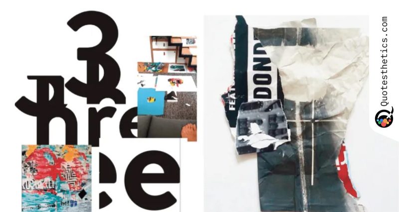
David Carson Design Unique
Learn more

Never mistake legibility for communication. Just because something is legible doesn’t mean it communicates. More importantly, it doesn’t mean it communicates the right thing.

David Carson
David Carson

An American graphic designer and surfer, best known for his innovative magazine design (Ray Gun), and use of experimental typography.

  • Design & Arts
  • Communication
  • Design Principles
  • Legibility
  • Typography
Click to rate
1 Star2 Stars3 Stars4 Stars5 Stars
Loading...
Learn more

Perfect communication is person-to-person. You see me, hear me, smell me, touch me. Television is the second form of communication; you can see me and hear me. Radio is the next; you hear me, but you don’t see me. And then comes print. You can’t see or hear me, so you must be able to interpret the kind of person I am from what is on the printed page. That’s where typographic design comes in.

Aaron Burns
Aaron Burns

An American film producer, actor, film director, screenwriter, film editor, and cinematographer.

  • Design & Arts
  • Typography
Click to rate
1 Star2 Stars3 Stars4 Stars5 Stars
Loading...