Gap customers weren’t just buying hoodies, but actively shaping the brand
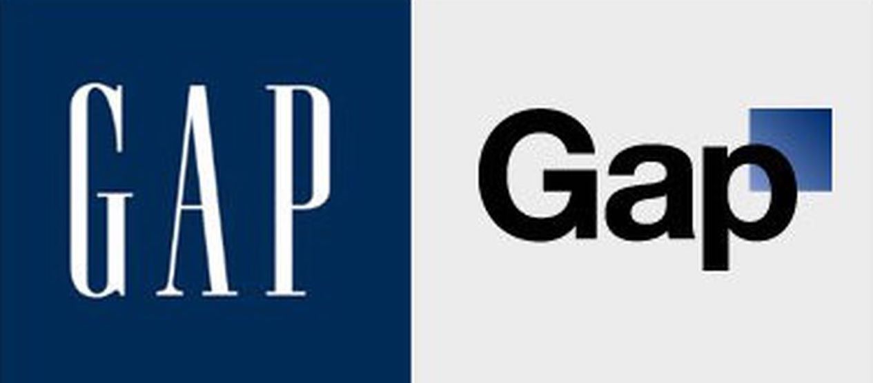
In 2010, the US clothing chain GAP tried to change its logo. For decades, the logo had been white lettering on a blue square, with a classic feel. In 2010, the business tried to offer a more snappy, modern looking logo.
 But consumers mourned the loss of the old version. Then the following happened. A backlash built, with customers taking to Social Media, Facebook and Twitter, where they expressed disappointment and even anger.
The Result? — The rebranded logo that lasted a week
In the past, if a consumer wanted to give feedback or to express dissatisfaction about a product, they’d need to write or call HQ. Today, social networks allow consumers to interact with brands in a far more immediate and impactful way.
A week later, Gap’s brand team released a statement, saying that they would revert back to their classic logo.
In this case, the changing habits of consumers led to some of them actively shaping the brand.
Additionally, the cost of the rebranding was estimated to be around $100 million dollars and resulting in no changes in revenue or online search traffic.


