• Design & Arts

Use constraints to improve the clarity, usability and intuitiveness of your design

Constrains, as methods of limiting the actions that can be performed on a system, simplify usability and minimize errors. For example, dimming or hiding options that are not available at a particular time effectively constrains the options that can be selected.

Proper application of constraints in this fashion makes designs easier to use and dramatically reduces the probability of error during interaction. Simply put; constrains simplify usability and minimize errors!

There are two kinds of constraints:

  1. Physical constraints
  2. Psychological constraints

Physical constraints limit the range of possible actions by redirecting physical motion in specific ways. The three kinds of physical constraints are paths, axes, and barriers.

Psychological constraints limit the range of possible actions by leveraging the way people perceive and think about the world. The three kinds of psychological constraints are symbols, conventions, and mappings.

(Symbols influence behavior by communicating meaning through language, such as the text and icon on a warning sign. Conventions influence behavior based on learned traditions and practices, such as “red means stop, green means go.” Mappings influence behavior based on the perceived relationships between elements. For example, light switches that are close to a set of lights are perceived to be more related than switches that are far away.)

Psychological constraints are great way to improve the clarity and intuitiveness of a design.

Wanna know more? Follow the source!

The text above was taken and slightly edited from the following sources.

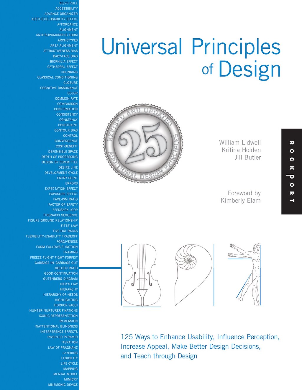
Universal Principles of Design

Universal Principles of Design (Book) by William Lidwell Kritina Holden

  • Design Principles
  • UX Design
Click to rate
1 Star2 Stars3 Stars4 Stars5 Stars
Loading...
Surprise me!